

or Can I make something out of nothing?
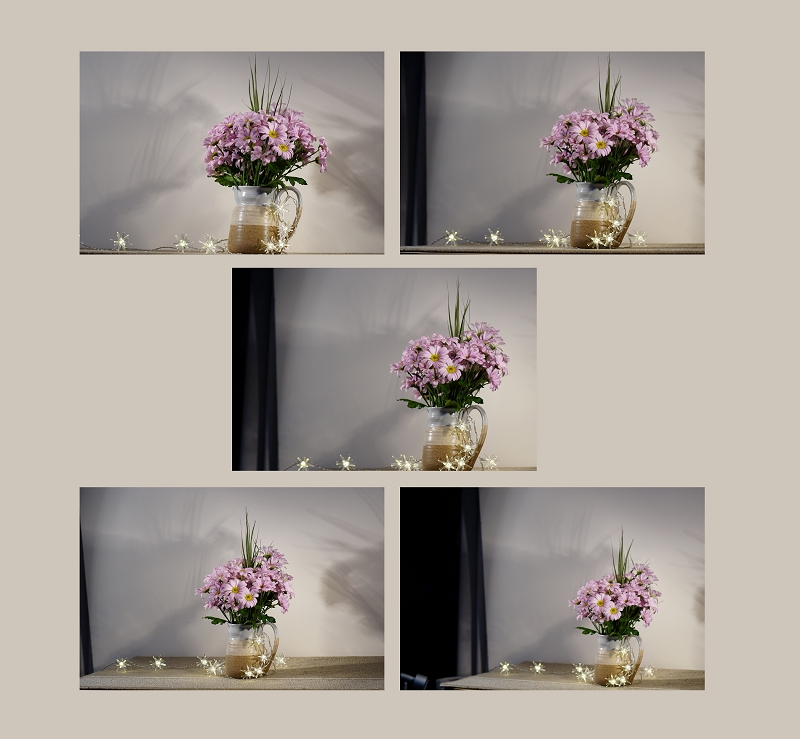
I have so many folders that I mentally label as “Failed shoot”. It’s a product of my habit of taking a few shots ‘just in case’ … just in case I later regret that I didn’t! I came across a folder from January 2018 just called ‘Pinks’. I was curious, it rang no bells, triggered no memories. Inside were just 5 shots. Then I remembered. I was putting away Christmas lights that we hadn’t used. And I thought I’d turn them on and maybe take a few shots before they vanished back into the cupboard for another year. In a hurry to finish the tidying up I put them together with a jug of flowers that was close by – and took a few shots.
The results didn’t impress me when I looked at them later on. The lights didn’t sparkle at all, they added nothing. The wall I’d placed the jug against was nicely neutral, but in my haste I’d overlooked the cast shadows. Rather disappointed I mentally stamped the folder “Failed”. Only 5 shots in all, so I didn’t delete them at once.
Later that year I brought the folder out of mothballs, and took another look. I wanted something to play with, to experiment with the newly installed suite of Photoshop plug-ins called NIK. And if I liked the image that emerged, I could use it with my Sunday group that specialises in post-processing to transform a photographic image.
step 1
Looking at the originals, I decided to try number 3. I didn’t want too many cast shadows, and I didn’t want too much of the table surface either … I might want the jug to feel like it was free-floating.
step 2
was to take it into Camera RAW, straighten it slightly, lighten it, and crop off the dark band on the left side. Then into Photoshop to play and see what might work to make something visually interesting out of the image!
step 3
was to launch the NIK panel. What might work? I selected Color Efex Pro 4 panel and then Bi-colour, as I wanted something to jazz the image up and bring it to life.

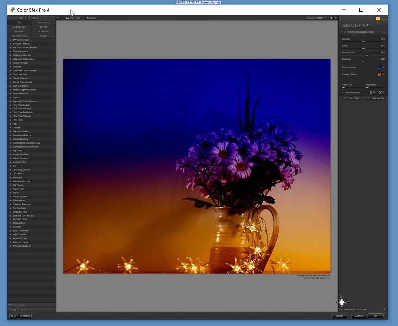
That looked like a promising start to making something new.
step 4
the top colour looked nice and rich, but it was a solid blue-purple block. Maybe it needed something subtle to break it up?
I’ve been collecting texture layers for a long while now. Flickr users are so generous, and make lots of beautiful texture layers available to fellow Flickr members. I also started to look at commercial collections for added effects. Design Cuts was the place that I began, as they offer bundles of discounted graphics and files, and I could try out different suppliers and see what suited me. My big favourite is 2 Lil Owls and from Denise I have some amazing effects, like light flares.
So I looked in my 2LO collection called Crazy Flares, which mixes light flares with all manner of textures. And I selected this one

These light flares needed to be overlaid, and then used in Screen mode for the best effect.

That’s better! beginning to shape up!
step 5
was to save that image as a jpeg. I needed a single layer for my next idea. So I saved the PSD file as it is, then saved the layered image to start again. I opened the newly saved image as a Smart Object into a new PSD file as this allowed me to easily play with the Photoshop’s inbuilt filters … I wanted yet more light effects ;o)
step 6
was to apply the Filter -> Render -> Lens Flare effects. Because the image is a Smart Object I could access the effects window and adjust it easily to get the intensity, direction and actual lens simulation that looked best.

Yes – that looked OK, and better than my starter image!
step 7
was to gently wipe out a little of the bleaching effect of the light falling on the petals – a little more intensity for the petals, please! So I highlighted the mask, and removed a little of the glare.
And now I have something that has more interest than the original – there’s more going on visually. Colour-wise there’s an interesting play with the bi-colour division set up in the NIK. The final lens flare has added to the ochre tints in the lower half. The light flares and text texturing has lightened and added interest to the upper blue-purple half. And the flowers in the jug are the vertical that joins the two horizontal planes. Finally, the petals towards the top right of the image are balanced by the lens flare circles in the bottom left.
Maybe I’ll post it and see what happens … now I just need a name for it ;o)
So I posted it on Flickr to see what people thought – here
Flickr holds Elisa’s online Photo Gallery
© 2019 Elisa Liddell