
Composition – thoughts on Negative Space
Which is, perhaps, one of the most unfortunate phrases in all of art and photography! To western minds ‘negative’ has so many connotations, and all of them are negative!! It is a concept that arrived from Japan in the 19th century, as Japan was opening up to trade with the West. Europe (and especially France) fell in love with the exotic and the oriental. For French artists the art of Japan was a revelation – it was so completely different from everything European artists had been taught to admire and emulate. Some of the first images to circulate in Paris were the wrapping papers used to protect valuable ceramics. And they were block prints. It is hard for us now to understand just how revolutionary these glimpses into Japanese folk art were – and also how little the European artists could find out about the history and philosophy that lay behind the images they were seeing for the first time.
So let’s consider briefly just what the European art establishment (especially in France and Italy) considered good art to be. Everything was codified and rigidly taught to budding artists (only men of course!) – and the preferred models were Greek and Roman statues, stories and frescoes . The aspiring artist’s ambition was to paint great canvases telling historical stories of Ancient Greece and Rome ; or religious canvases for churches or cathedrals; or landscapes that referenced Ancient Greece or Rome in their mythic settings.

The canvases are packed full of figures, improbably posed and dressed. To our modern eyes they seem both overly ‘busy’ and oddly stiff and posed.
So what must it have been like for artists brought up to admire Claude Lorraine’s idealised and mythic landscapes, to see a wood block print of Mount Fuji?

There were already groups of rebellious artists in Paris who were struggling to break away from the Academies, and to paint the everyday real life of the city and countryside. They wanted to paint en plein air outside the studio, and to observe nature rather than to remake it in idealised studio paintings. They were the Impressionists. It was this group of painters who were ready and eager to embrace the ideas and images that came from far away Japan.
The simplified shapes, the stylised figures and the sense of a space to ‘breathe’ within the frame were all much admired, and learned from by the Impressionists.
The Impressionist I have studied most closely is Edgar Degas, as he worked in pastels, and I learn from him! By the way, in his day pastel was looked down on as inferior to oil paint, and dismissed as only for women! So he broke with that convention too!
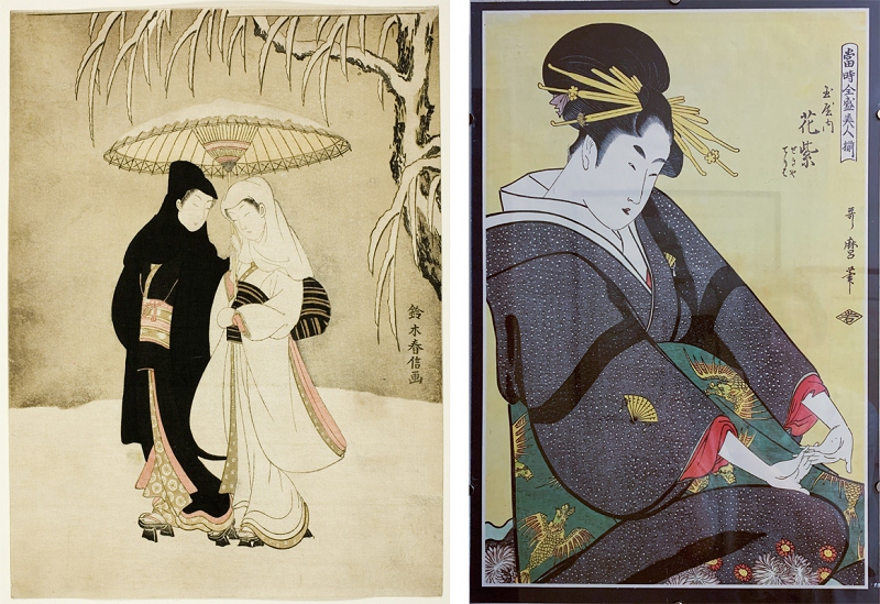
But he embraced photography for ideas and inspiration (as we have seen in Place de La Concorde) and he also embraced the Japanese ideas on composition too. Both are visible here …

Both these compositions use large areas of negative space, which was criticised by contemporary art critics, who found it ‘unfinished’ at best.
So – fast forward 150 years to today. We have so much more knowledge at our fingertips, with many books and online resources, and decades of research and exchange of ideas. So what do we make of the Japanese concept of Ma?
I suspect that we don’t know that much more than the early Impressionists.

Ma is the Japanese for what we call negative space. The Kanji is made up of two others, door or doorway and sun (or in an earlier form moon). So the pictogram reads roughly ‘door letting in sunshine’ or moonshine. It has a meaning of ‘space’, ‘gap’ or ‘pause’. And in the picture frame it does give a pause for the viewer, and space to rest the eye. But I like the analogy of a cup or bowl. A bowl is made up of both the solid clay, but equally it is the space within that gives it its purpose. A bowl is equal parts solid and space, it cannot be a bowl if either part is missing! That chimes with the doorway and the sun/moon. Without a door you cannot enter or leave the room or house. Equally light cannot enter without the absence of a wall – a space within the wall. For us that would be a window, for the traditional Japanese house it would have been a sliding shoji or screen.
So in our composition the negative space is not just absence, it has a dynamic quality. It exists in relation to the positive space(s) within the composition. Neither can do their jobs without being in balance with each other. Like a good poem, where taking away or adding one word would spoil the poem, the balance between negative and positive space within an image should (ideally) be such that taking away or adding space would detract from the image.
I don’t pretend to know everything about negative space, only that I keep on trying to use what I have learned when I approach my photos, and start to edit them in Photoshop (my go-to post-processing program is PS CS5). And yes, I always run photos through PS – I think of it like the old style B+W Darkroom routine for printing a shot. So I’ll do just one small example ….
a single Freesia and negative space.
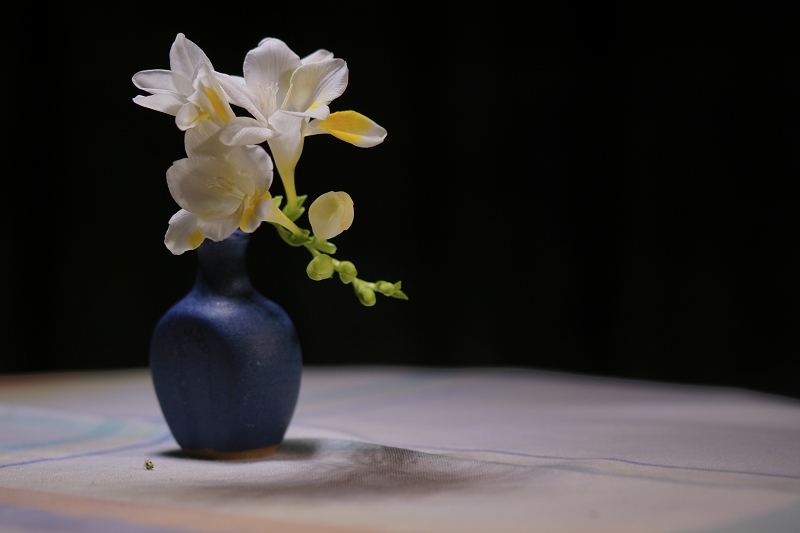
Before taking the shot.
I have an idea of what I want to shoot, and how I will light it to give me the shot I want. The freesia has such delicate petals that shine white and egg-yolk yellow. That is top of my mental tick list. I am also fascinated by the complexity of the freesia flower stem – there’s so much more there than with most other single flowers. The tiny dark blue bud vase is great for the shot, as it is roughly the same height and size as the flower itself. My plan is to light it from above to shine onto the petals. That will keep the vase colour dark so it won’t take the eye away from the flower itself. So I set the vase on a tablecloth that has some linear pattern on it, including blue to echo the vase. I’ve got a small round table where I can place my simple still life and shine the light above it. Looking at the arrangement in place I see the shadows cast by the light on the tablecloth, and the ring of light round the base of the vase. Good! I hadn’t foreseen that effect. There is also a little bit that has fallen from the flower – fine, I’ll leave that as it is. There are small folds in the cloth too – I’ll leave them as they are, as they add interest to the shadows (or maybe because I just don’t want to have to iron the cloth again!)
So I’m ready for the shot. I will place the freesia to one side. Why? Because the black backcloth is giving me my potential negative space, and this way I have plenty of space to the right or left of the vase. I will want to play with cropping that extra space to get the best composition I can.
I shoot in RAW and Jpeg, then convert the RAW file into TIFF as Sony ARW files are not recognised in Adobe Camera RAW. It makes for a big file size; the Jpeg will be about 4 MB, the final Tiff file is about 68 MB. Any processing I do will inevitably degrade the image a little, but it won’t be noticeable if I use the uncompressed Tiff file.
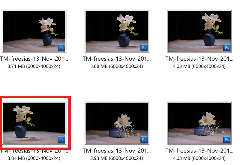
I only took 4 shots, and they were part of a larger photoshoot using the freesia together with a range of props.
Into Photoshop now, and the fun begins
Firstly I was interested to see if the severe black background was the best way to go. The light was from above – what would happen if I added a layer of light shining from the top down? I chose a light layer, and adjusted the tone to a light blue, and tried it out.
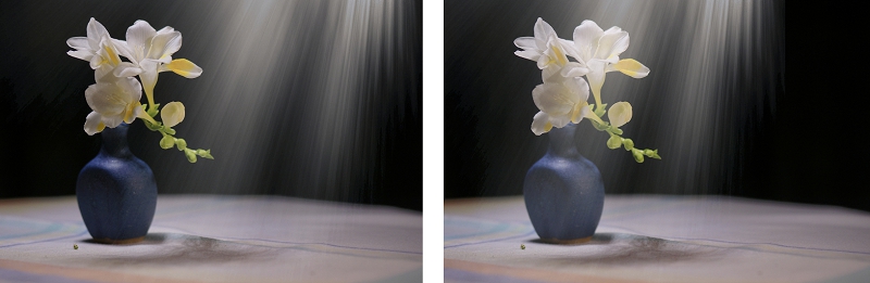
To my mind the light flare takes the eye away from the freesia and doesn’t really add anything to the composition. So maybe not at the moment!
And so on to the cropping: I tried out a range of possible crops from placing the vase and flower right in the middle of the ‘canvas’ to a little more off-centre

Here I found the centred image does bring the vase up close, but the eye has almost nowhere to go except up and down the subject. If I give another bit of space to the right of the vase there is a sense of movement developing, as the eye travels down the curve of the little buds, and arrives on the tablecloth and the shadows. Yes – the shadows are now a real, active part of the image. That extra bit of space gives the dynamic element I want. I often add a Quick Mask to an image, and use it to draw a simple silhouette shape and see what it looks like.
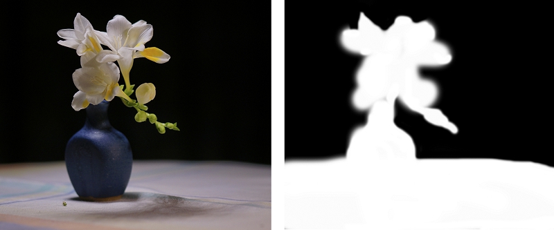
Here the negative space (in black) has an interesting shape in itself (always a promising sign) and although the white expanse of the tabletop looks rather large, in reality it is needed to give us the shadows and the lines on the cloth. And you can see clearly the curve through the flower reaching down to the table.
So, after much deliberation, the final shot that emerged from the morning shoot is …

I don’t always go through such a long process with every image! But it is helpful at times, especially with still life shots, to step back and analyse what it is you like or don’t feel satisfied with in an image you are working on. The changes you finally make might be minimal, or they might completely transform the original. It is all part of the joy of photography, and especially digital photography.
But in among it all – there is a place for continuing awareness and appreciation of negative space, and its subtle power to transform an image so quietly!
Back to the Zen Camera cover page
Back to Back to Basics 1
Flickr holds Elisa’s online Photo Gallery
© 2019 Elisa Liddell