

As I approach watercolour painting for a second time, after a long break, why have I chosen Cezanne as my guide and teacher? Well, his watercolours are mainly either landscape or still life – the two areas I am interested in. Yes – but it’s more than that.
He painted hundreds of watercolours, but rarely displayed any. Maybe he thought they were inconsequential (in his day watercolour was seen as a second-rate medium) – maybe he used them to think about a subject – maybe they were a personal passion, and private. I can’t say. But to me they are more ‘alive’, more vibrant than his finished oil works. To me they express his soul in a way that moves me, and I want to learn from them.
But I need to dig deeper into why they draw me, and leave me breathless in admiration.
If I look at the photographic work I do, there may be some clues. The camera lens can do so much. A macro lens can show details that escape the naked eye. A landscape lens can record the scene before me accurately. Specialist lenses like the Lensbaby can distort the image in surprising ways. I enjoy all of those capabilities, but I don’t want to reproduce them in paint! But some of the qualities and effects I seek through the lens do resonate when I look at a Cezanne watercolour:

Minimalism
He can take a landscape and extract the essence of the scene. With delicate strokes he can suggest an entire landscape with a minimum of paint.
Light
The paper is rarely if ever covered in paint. The white of the paper shines through, and allows the subject room to ‘breathe’…. to suggest rather than reproduce the subject in detail.
Use of colour
The closer you look, the more you realise that the colour choices he makes are quite amazing. And the variations in tint and brightness make the subject vibrate and sing!
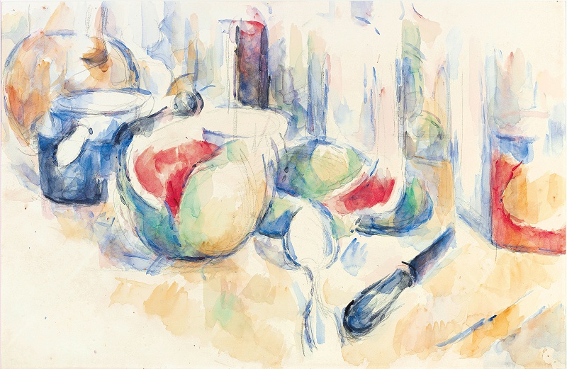
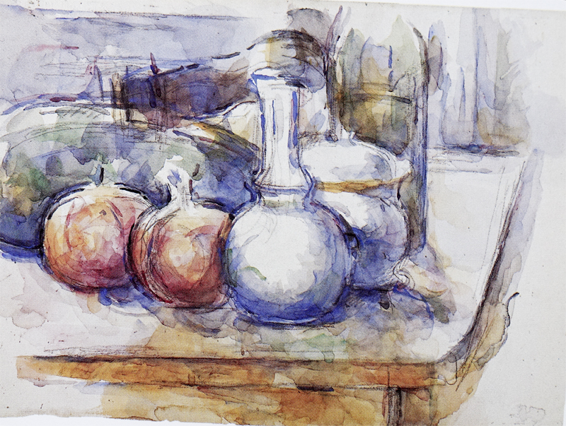
These are just three of the things that draw me to study Cezanne. I want to discover how he can paint a watermelon, an onion, a knife or a carafe and be both a suggestion – an impression – and also jump off the page as so alive I feel I could reach out and touch it!
So some research was called for! I needed to find out how he created the watercolours, and then start to study them carefully!
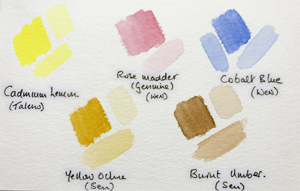
Luckily I came across some information about the palette he used. It comprised just 3 colours – lemon yellow, cobalt blue, rose madder (genuine). To save having to mix them each time – I added yellow ochre and burnt umber.

And I made up a small box of the same colours. OK I added one of my own favourites – Payne’s grey for darker lines. The plan was (and still is) to work on copying Cezanne using his palette.
On to Watercolour 2 – Study and learn through copying
Back to the Watercolour cover page
Back to the Hands On cover page
Flickr holds Elisa’s online Photo Gallery
© 2021 Elisa Liddell