In the style of Cezanne
My next move was to experiment using the things I was learning about Cezanne’s techniques and palette. Could I take the bare bones of an idea he sketched out, and develop it myself? Taking away the colour, the paint, and just with a hint of outlines from a minimal drawing. There is so much in there, just waiting to be developed. He had an eye for extracting the essentials.

I started by making a pencil drawing of this painted sketch. The motif of the lone tree, the viaduct and the distant mountains that merge into the sky. Using the motif I began with faint pencil lines …..

…. and the minimal Cezanne palette. I did several versions – some thinking of the colours that I am more likely to see locally here in the north of Scotland and then thinking about how to create the sense of volume in the foliage, or the sense of the receding landscape to give depth.
Only then did I look back at the original and see where my decisions and thinking were different. Later I used them in another experiment, blending them with landscape photographs of my own.

Here I blended one version of the tree with a view across the Moray Firth. It was the sense of the receding landscape that made me think of the shots I take looking along the receding coastline here.
Might the foreground tree add something, and make something interesting?

Some of Cezanne’s drawings are so fleeting, so minimal that they are compelling and tantalising. There is a whole world of possibilities that I am just beginning to explore!
One thing that I learned was how Cezanne created harmonies by using the same colours and tones across the ‘canvas’. He built up an image using layers upon layers with slight tonal differences, that create both depth and also a unity that makes the whole visually satisfying.
My early experiments are both minimal and very simple! But faced with a blank sheet of paper it soon becomes apparent that you need a clear idea of where you want to go!

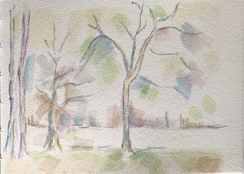
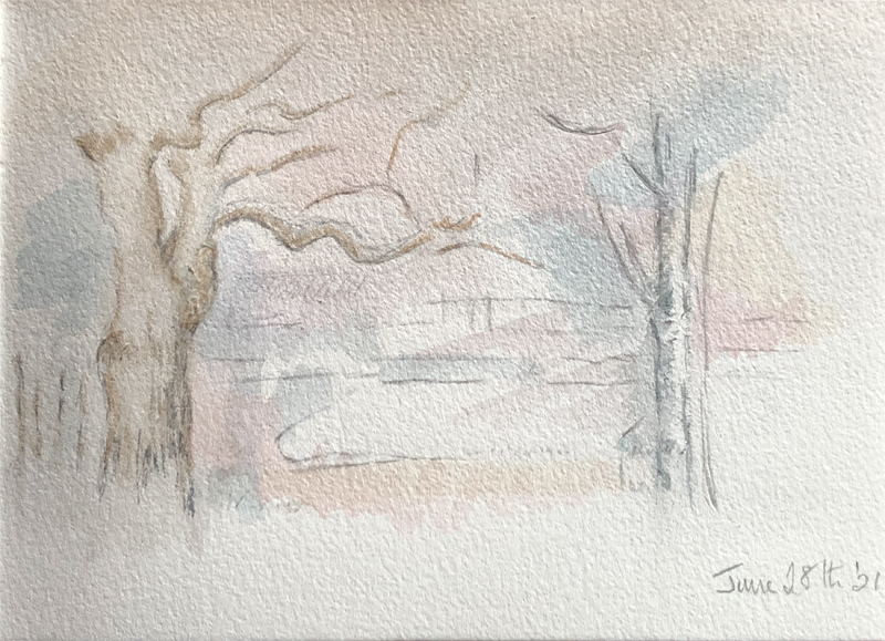
So I am off on my own, with the merest hint of a tree or two. A hint of foreground and more distance across the water.

The same outlines, but in reverse. Again trying for a unity across the page – a sense of foliage and sky, of the solidity of the earth …. and using Payne’s Grey (a lovely grey with a hint of blue)on a fine rigger brush to suggest the lines of the trees.

And starting to use more solid trees and tree trunks from my own landscape, but keeping the touches gentle and soft, and as simple as possible.
Ah – that magic word simple. We tend to think of simplifying something as making it easier. But the kind of simplification that Cezanne is a master of is, in fact, a complex and subtle process that is learned and refined over years! How to ‘simplify’ a landscape yet keep the spirit, shape and essence of what you are seeing – and then translate it into a painted image that is not just a version of a photograph. That is no simple task!
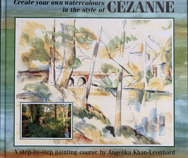
I came across a handbook that has proved useful in this process of simplifying …..

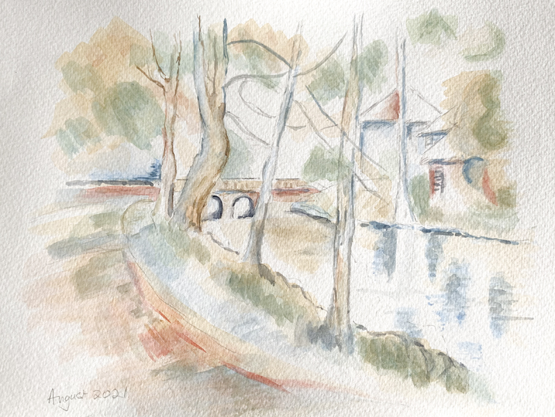
The header image of this page is my version of this cover image. The book takes a fully realised Cezanne landscape and breaks it down into steps – applying layers of colour across the canvas. Then some details from the image are looked at more closely.
Using the original palette (and even the brushes) it is a useful way to get to grips with his technique, copying and the giving other images the ‘Cezanne treatment’. These exercises are a good way to expand my understanding of his way of working and thinking. But sooner or later I need to choose a palette for myself, and look into the full range of watercolour paints that are available now….
On to Watercolour 4 – Choose a palette – cutting the ties!
Back to the Watercolour cover page
Back to the Hands On cover page
Flickr holds Elisa’s online Photo Gallery
© 2021 Elisa Liddell
