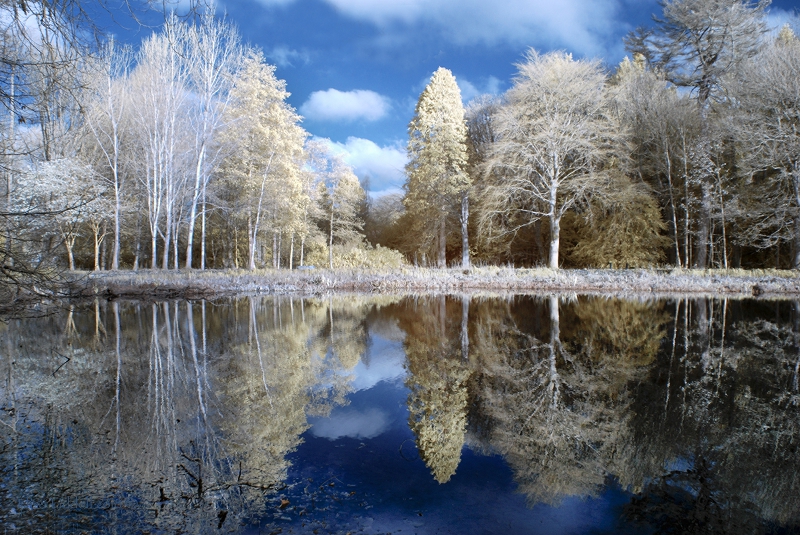
Trees reflected in the loch at Fyvie Castle. Infrared FAUX
My Adventures in the IR Wonderland
Infrared (IR) photography first really caught my attention in 2015, through looking at IR groups on Flickr. I loved the different ‘view’ it offered, making even familiar places and subjects fresh and new to my eyes. I began by using Photoshop, and trying the B+W adjustment layer, which offered infrared as an option. Disappointed I turned to the internet, and found a wealth of information, most of it too technical to help a complete beginner. I though about using a screw-on filter as the simplest way to experiment, but soon learned that Sony cameras were the least successful for IR shooting. I’m a Sony fan, so I had an additional problem!
Then in 2016 I learned about IR converted cameras. These are usually old cameras that have been modified to shoot ONLY in IR. I found an old Nikon D90 on eBay, and the adventure began.
The pages here follow roughly the stages or steps that I have followed as I gradually learned more, and experimented. The first 6 pages cover the 2 converted Nikons – a D90 with a 720nm filter, and a D80 with a Super Goldie 580nm
Infrared first steps The start of my adventure, from Photoshop disappointment to Nikon delight. First experimental shots.
Infrared second steps The next step in the adventure, learning what IR does to the colours we see with our eyes. A still life experiment with colour, B+W and IR versions of the same set-up.
Infrared third steps Taking my ‘new’ Nikon and its 720nm filter out and about shooting landscape, sky, trees and water. And comparing full colour, B+W and infrared shots of the same scene.
Infrared fourth steps Enter the Super Goldie! I buy a second Nikon, a D80 with the 590nm Super Goldie filter. This allows more of the colour spectrum in, and moves from the B+W realm into a fantasy land of surreal colour.
Infrared fifth steps FAUX post processing. Moving from the SOOC shots with a little Photoshop to tweak the shot to using a Photoshop Action (free to download) to apply colour inversions, and refinements to Goldie shots. I use the Khromagery action.
Infrared sixth steps FAUX processing taken even further with the Photoshop Supply action (free to download) which includes 9 separate action that you can use, mix and experiment with to create a range of surreal effects.
The next pages will be about using converted Sony A5000 cameras.
Infrared shot of Fyvie loch with bench. Nikon D90 with 720nm filter
No, it’s not red! And it’s not winter here either! It is summertime at Fyvie loch, and I used a custom converted camera to take this shot. I’m writing a series of articles about my adventures in the ‘Wonderland’ of Infrared (IR) photography – quite as exciting a world as Alice found through the looking-glass! It starts here, and covers the three infrared filters that I have; the 720nm the 850nm and the 590nm (Super-Goldie) I’ve not finished it all yet, but the gentle 720nm was my very first infrared filter, and my way into the whole IR world. So I wrote about it first. It taught me about how the colours can be completely different and quite unexpected too. I looked at using it shooting still-life compositions, as well as the more familiar landscape shots. This is the section I have already completed. My first ever landscape shoot is followed back into the ‘studio’, with the post-processing here. I have a gallery of all the infrared photographs I’ve posted online on Flickr
Infrared shot of Fyvie loch with bench. Nikon D90 with 720nm filter
“Adventures in the Infrared wonderland – part 3”
The best way to learn what any camera can do for you is, needless to say, to get out there and start shooting. And thanks to digital cameras that doesn’t have to be an expensive undertaking. Shoot as much as you can, and then ponder the results and see what works and what doesn’t. Then you can start figuring out how and why some things work and others don’t. You may waste a few shooting sessions – but only in discarded shots – they will be invaluable learning experiences!
So here’s a taste of my own first outing. I’d only managed a few shots of the house and garden and the field across the road with my converted Nikon D90 – nothing more daring! So this morning in July 2016 I set off to shoot one of my favourite local haunts – Fyvie Castle and the loch-side walk. Plenty of trees, water and sky – a place I am familiar with. That day I also had my little Sony RX100 in my pocket, taking a few shots of the lush greenery with it as I walked along. So here is the loch-side walk in full colour that July morning in 2016. The sky was bright, but overcast, with little or no blue at all.
Fyvie loch shot in full colour with the Sony RX100
And if I was to do a B+W conversion of the same shot, it would look something like this. (processed in Photoshop)
Fyvie loch full colour – converted to B+W in Photoshop
I like both versions, they both work for me. Here the lush eye-catching greens have gone, and the shapes of the trees and water irises are clearer. And the green algae floating on the surface is now an elegant white. There’s plenty of ‘punch’ to this B+W version – it is maybe even more dramatic than the colour version.
Now let’s have a look at how Infrared can give us a different view, a different landscape, a different visual world. I happened to take one shot quite close to where I stood when I took the RX100 one I’ve used. It is essentially the same scene but taken from a slightly different point along the walk.
Fyvie loch shot with the Nikon D90 Infrared converted camera. 720nm
The first impression is of a much softer and gentler image than either the full colour or the B+W version. Different things catch the eye. The trees blend into the overall image, as the tones are close to those of the sky and the water. The tonal progress through the image is simplified, it moves from a dark foreground to a white background sky. Look closer and the subtle gradations of grey begin to emerge. From this position there is more of the loch in the frame, so we can see the way the trees darken as the far point of the water is reached. There’s even a strip of the distant hills many miles beyond – and, look the infrared camera has caught the slight hint of clouds in the sky! In the foreground the reflections are much more prominent, while the left-hand mass of water irises is less distinct. Now let’s take a step back and look at how this infrared image has reached this final state.
After 3 years I still find that shooting in infrared has the hit-and miss qualities that I found at the start. So let’s take a peek at some of the original infrared shots in their folder. A strange and bewildering mix of effects – some are blue, some have a distinctly yellow, slightly gold cast to the sky, and the final one is recognisably grey.
Photoshop Bridge showing part of the folder of Infrared shots
The very pale blue shots are pretty well blown out, and most probably destined for the bin! The others are all possible, with the slightly yellow sky, and white trees with a tinge of blue. Something I discovered during that first photoshoot is that it helps the composition and the shot a lot if you can: a) shoot from shade towards light b) have some darker areas such a stone, tree trunks and pathways in your scene. These help define the scene, especially when there is a whole lot of green in the landscape you are shooting! As you can see there will be work to do in Photoshop – post-processing is definitely an integral part of the Infrared experience! Let’s start with the shot I’ve selected in the preview pane. It looks promising. I think it will look good if I used a B+W treatment to remove those tints. So into Camera Raw first.
Infrared shot imported into Camera Raw
Here I can straighten the shot if needed and check the exposure. I can also try out options like de-saturating or converting to B+W. Personally I like to save everything except exposure and straightening until I’m in Photoshop. But if I open the photo into Photoshop as an ‘object’ rather than an ‘image’ it does mean that I can return to Camera Raw and make extra adjustments at any time. So on to Photoshop ….
Infrared shot imported into Photoshop CS5
And here is where the real magic of post-processing happens. I want the image to be in pure B+W – to give me a range of tones that take me from deep black to almost pure white. The reflections of the trees in the water will be my guide for the blacks, together with the bottom left corner. If I get them correct I should also see more definition in the tree branches top left, and the near tree across the water. I finally choose B+W Neutral Density from the B+W options. The sky and the leaves are not as white as some other options, but there is a lovely range of greys in those branches and foliage.
Fyvie loch shot with the Nikon D90 Infrared converted camera. 720nm
So that is the final Infrared composition, that you saw alongside the colour and B+W versions. That is quite different to both the full colour shot and the B+W conversion. It and makes for a very different visual and emotional experience. I find that this camera and filter combination can give me the most delicate and ethereal images. And it definitely hooked me that day.
A few general observations before I continue looking into the folder of shots from that first outing. The first thing you realise is that what is green will turn out white with this Nikon + 720nm filter. Add to that anything that is already white and the effect of bright sunshine – and you have a heady mix of light in your shot. The blown-out shots in my folder show this! I had the Nikon set as it came, with Aperture Priority, and the ISO set at 200 and the White Balance pre-set for the filter. I’ve mainly left the settings that way, as they produce some wonderful effects, and I am no expert on how the camera sensors have been altered and adjusted. I admit I haven’t messed with the setting much at all – just to change the ISO a little on really bright days. I know I’ll have some dud shots, especially as the EVF shows me the full colour version as I take the shot. But for every dud I can find a shot that works like magic – so it can balance out.
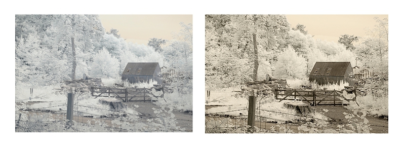
The old cabin in the woods. One of the shots showing in the folder is of an old storage shed that looks like it might be used as a wood store. The original shot looked really promising, with plenty of ‘dark’ objects – the path, tree trunks, gate, fence and the shed itself. After I had done the basic conversion to B+W in Photoshop I decided to try out a sepia effect, as it did already look like an old and abandoned shed. I sharpened the contrast, to give me deeper darks, and bring out the lovely definition in the trees, The full version is on my Flickr site: the log cabin in sepia
Fyvie Castle grounds. Cabin in the woods Infrared and added sepia tint
And now one that I have not worked on before. I recall thinking that the two strong tree trunks would frame the shot nicely – giving me a contrast between the shade and the bright sunlight beyond. I have used four stages or versions to show more of the process, and more of the options that are possible in post processing. Looking at the first shot here there is the original, which has a slight light blue tint to the sky, and a yellow tint to the water. There is a good strong variation of dark tones with the two trees, the branches arching over the top of the shot, and the actual bank at the bottom of the screen. When I took the shot into Camera Raw and applied ‘auto exposure’ there was almost no difference. The shot had not been either over or under exposed.
Fyvie loch through the trees. Two versions
I rather like the yellow tint to the water, it emphasises its difference – makes it stand out against both the shore and the trees. But I always like to see what effects I can achieve, before I settle on one interpretation of the image. My next stop was to apply a B+W conversion. Now the sky is whiter, which makes the branches and leaves clearer and a little darker against the new sky.
Fyvie loch through the trees. Two more versions
And as a final twist I applied a Faux colour action, which swaps some colour channels. I use this action mainly for the Goldie filter camera that I’ll be exploring next – but I thought I’d see what happened applying it to the original shot here. As I thought, the water is now a more ‘natural’ blue, and the pale blue tint is gone from the sky. I hope that this has given you a taste of what choices there are when it comes to processing your IR shots from the 720nm converted camera. Lots to play with!
I said earlier on “The very pale blue shots are pretty well blown out, and most probably destined for the bin!” But sometimes it is worth playing around and experimenting with the failed and blown out shots, before you finally give up on them. It’s always worth trying…
Here’s another shot from the folder
A blown out Infrared shot reclaimed
What I wanted to catch was the diagonal sweep of the leaves. The strong uprights of the trunks and the downwards diagonal sweep of the foliage really caught my attention. So I was disappointed that the result seemed past rescuing. I left it alone, reluctant to discard it completely. So I tried again with the knowledge I acquired over the last 3 years – and I think it was worth the effort and the wait. I first applied the FAUX action in Photoshop and was delighted at the increased definition it has uncovered. There are brown tints in some of the tree trunks, and gentle ‘blue rinse’ across the foliage that I really like. I then went on to take the FAUX version and convert that into B+W. It has kept the improved definition in the foliage nicely. Personally, I think there is more interest in the FAUX version, a greater sense of depth in the scene too. So – that is a brief look into one folder – one morning spent with the IR converted old Nikon D90 – warts and all! I hope that it has been an interesting adventure for you, as it was for me.
The next article will take a look at the second IR converted Nikon I bought that year, which can produce quite amazing images that show that ‘infrared’ doesn’t necessarily mean B+W. On to the Super Goldie
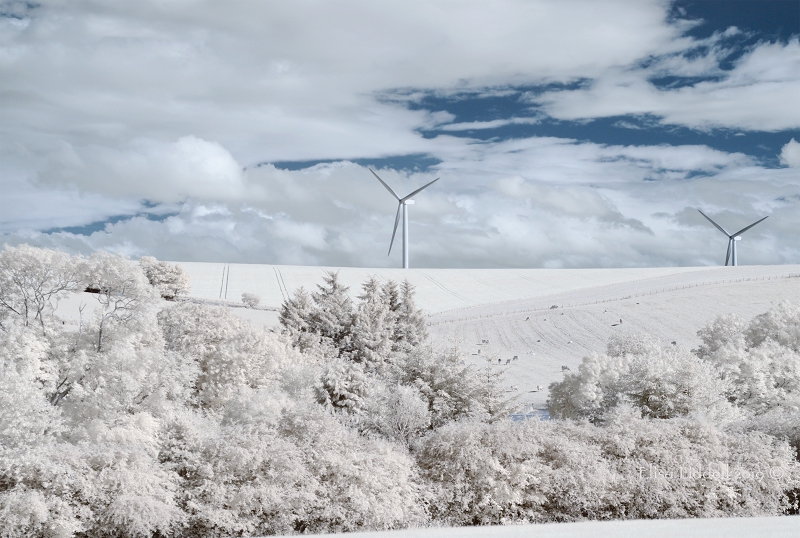
Infrared view across the howe (valley) of the river Ythan, Aberdeenshire, Scotland.
“Adventures in the Infrared wonderland – part 2”
And it IS a new way of looking at the world, and an exciting one that I am so pleased I can enjoy.
My Nikon has some limitations for me. I’ve left the settings as they were when I bought the camera as I still struggle to understand the on-board computer on the Nikon D80 and D90! I still use the kit lens too. There was (and still is) enough to master without adding new lenses to the mix. It is quite a substantial weight and bulk too. Most of my cameras are small Sony NEX-6 or 7 along with the RX100 in my pocket.
3 cameras I use – comparison in terms of size and weight
Left, The Nikon D90 with kit lens – Middle, NEX-6 with macro lens – Right, RX100 Weight: Nikon 945gms/2lb1oz Nex-6 530gms/1lb 2oz RX100 260gms/9.5oz
Looking through the view-finder I see the full colour image, so I needed to learn how to ‘see’ in my mind what the infrared image was going to look like. It’s a knack you develop over time, by trial and error. Happily there’s no cost for dud shots (and I’ve taken plenty!) So you need to pause and look at the shot on the LED ‘review’ screen and see if it works in IR. Most of what I’ve seen online are landscape shots, and that is a good part of what attracted me. There’s a whole lot of landscape and seascape here, and so many trees too. So I have taken my Nikon to each and every place I go shooting. It has refreshed familiar scenes to see them in a new way. But I rather wish that I had approached my IR journey of discovery by another route. Let me explain. I’ve made a still life comparison sequence here to show how the normal full colour photo can be rendered in PS into B+W, and then compared with the same shot taken on the Nikon IR 720nm. Well, the Nikon shot is almost the same, as I had partially dismantled the still life before the idea of a 3-way comparison struck me ;o) Here is the original still-life shot that I took for a Flickr challenge to include many colours. I’ve got blue, lavender and turquoise in the blue spectrum – reds and greens – then orange and golden tints as well as a patterned white background. The eyes are naturally drawn to the bright oranges, the reds and the blue glass vase first.
A colourful festive still life composition
Transpose the shot into B+W and the blue glass along with the reds and greens become the dark tones, while the oranges have become the lightest tints. Look closely and the oranges still have their skin textures, as does everything else. The red berries may be darker, but you can see the sugary coating on each berry. The sparkles on the red and gold pine cones are also very clear. And the pine needles on the bottom left of the arrangement are even clearer than in the original shot. By removing the colour the textures of the elements has been made clearer.
The colourful festive still life composition in B+W
So what happens when you look through Infrared eyes? My arrangement is a little different, as I explained, but all the elements are still there. The first and most striking thing is that the blue glass is now completely transparent and only the optical distortion of the background pattern shows you that it is still there. The IR has also brought out the shadow cast by the glass, which is barely visible in the other 2 versions. It has done the same with the shadow cast by the clock. Look next at what it has done to the reds. Both the berries and the small ribbon bow at the very front are now white. The greens are also white, which is no surprise (one of the striking things we know about IR, tree leaves and grass become white) but look at the three oranges! They could be made of porcelain, together with their leaves they are so strikingly white!
The colourful festive still life composition in Infrared
Another surprising thing is that there IS colour in there. It is the gentle turquoise that has won the colour accolade. The blue has gone completely, but the turquoise is now a grey-blue. And another surprise is that the two pine cones, one red and one golden now have the same tonal values, both equally dark – and in IR they emerge as the darkest values of all, followed by the shadows that were not prominent in the other versions. The shadows (and the strength of the background too) might be related to a different camera and different lens with different F stop – but the striking differences remain. Using the infrared light band of the colour spectrum offers a completely different view to that experienced by the human eye.
I’m not big on technicalities, but there’s a lot of information on the range of IR filters that are available. I know that they range from the 500s to the 800s and are referenced in ‘nm’. I have 3 strengths:
the 590nm (called the Super Goldie) which lets in more ‘normal’ colours that are within the IR spectrum
the 720nm which is the one I have used above. That lets in a little from the ‘normal’ colour range. As you have seen there is some blue, and some yellow in the shots I’ve used so far.
The 850 nm which is the closest to pure B+W in not admitting any other colours. I’ll be exploring what I have learned about all three in these articles. And adding to my own understanding as I go along – there’s nothing as helpful to learning as having to write about it. So this is helping me while (I hope) entertaining you! The first converted IR camera I bought was the Nikon D90 with the 720nm filter replacing the full colour original inside the camera itself.
So, on to part 3 where I’ll be considering the 720nm filter and what it can do