Hands-On Watercolours 3

in the style of Cezanne AK
Study in the style of Cezanne, from Angelika Khan Leonhard

In the style of Cezanne

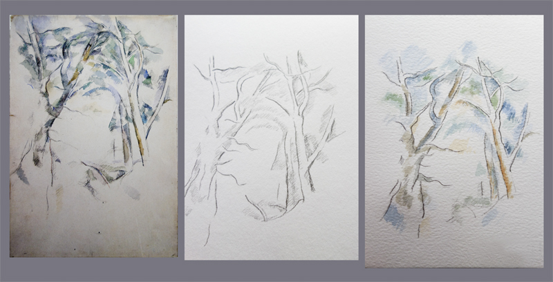
My next move was to experiment using the things I was learning about Cezanne’s techniques and palette. Could I take the bare bones of an idea he sketched out, and develop it myself? Taking away the colour, the paint, and just with a hint of outlines from a minimal drawing. There is so much in there, just waiting to be developed. He had an eye for extracting the essentials.

Cezanne painted sketch of tree

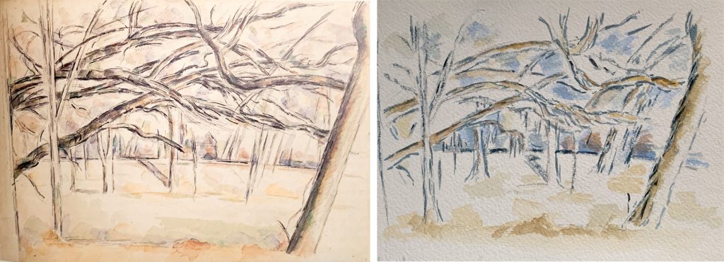
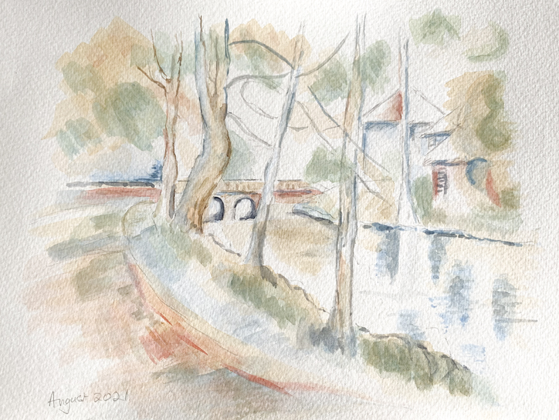
I started by making a pencil drawing of this painted sketch. The motif of the lone tree, the viaduct and the distant mountains that merge into the sky. Using the motif I began with faint pencil lines …..

based on a Cezanne sketch

…. and the minimal Cezanne palette. I did several versions – some thinking of the colours that I am more likely to see locally here in the north of Scotland and then thinking about how to create the sense of volume in the foliage, or the sense of the receding landscape to give depth.

Only then did I look back at the original and see where my decisions and thinking were different. Later I used them in another experiment, blending them with landscape photographs of my own.

blended watercolour and photo

Here I blended one version of the tree with a view across the Moray Firth. It was the sense of the receding landscape that made me think of the shots I take looking along the receding coastline here.

Might the foreground tree add something, and make something interesting?

Cezanne pencil sketch of tree

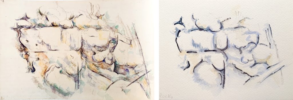
Some of Cezanne’s drawings are so fleeting, so minimal that they are compelling and tantalising. There is a whole world of possibilities that I am just beginning to explore!

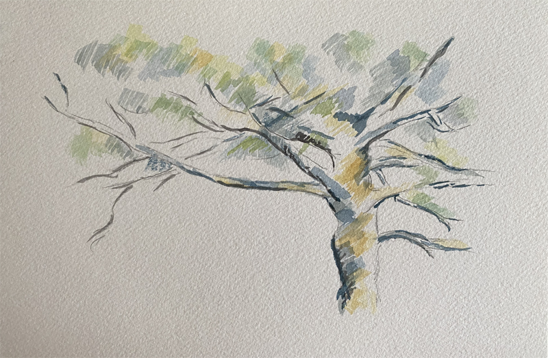
One thing that I learned was how Cezanne created harmonies by using the same colours and tones across the ‘canvas’. He built up an image using layers upon layers with slight tonal differences, that create both depth and also a unity that makes the whole visually satisfying.
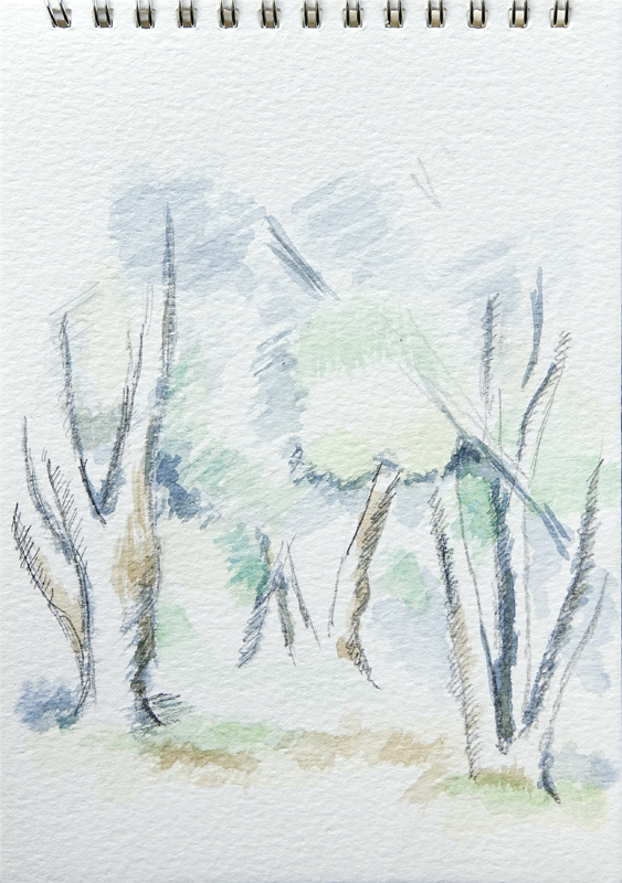
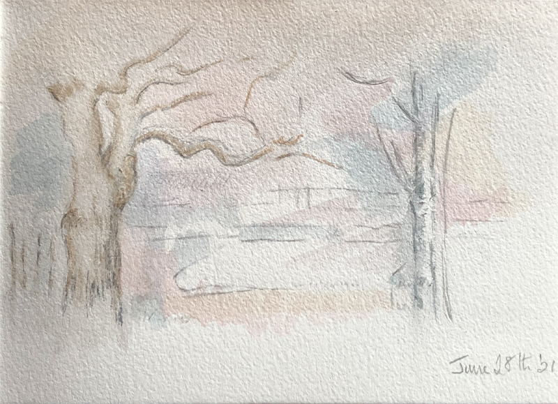
My early experiments are both minimal and very simple! But faced with a blank sheet of paper it soon becomes apparent that you need a clear idea of where you want to go!

in the style of Cezanne 1

So I am off on my own, with the merest hint of a tree or two. A hint of foreground and more distance across the water.

experiments in the style of Cezanne

The same outlines, but in reverse. Again trying for a unity across the page – a sense of foliage and sky, of the solidity of the earth …. and using Payne’s Grey (a lovely grey with a hint of blue)on a fine rigger brush to suggest the lines of the trees.

Tree trunks watercolour

And starting to use more solid trees and tree trunks from my own landscape, but keeping the touches gentle and soft, and as simple as possible.

Ah – that magic word simple. We tend to think of simplifying something as making it easier. But the kind of simplification that Cezanne is a master of is, in fact, a complex and subtle process that is learned and refined over years! How to ‘simplify’ a landscape yet keep the spirit, shape and essence of what you are seeing – and then translate it into a painted image that is not just a version of a photograph. That is no simple task!
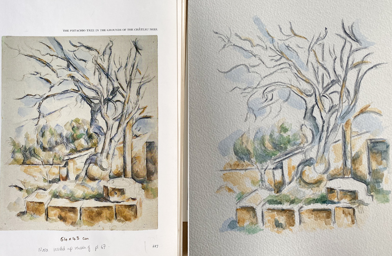
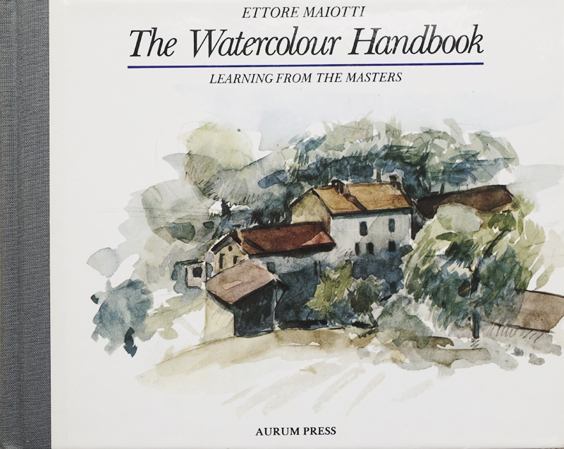
I came across a handbook that has proved useful in this process of simplifying …..

Book cover Angelika Khan-Leonhard

The header image of this page is my version of this cover image. The book takes a fully realised Cezanne landscape and breaks it down into steps – applying layers of colour across the canvas. Then some details from the image are looked at more closely.

Using the original palette (and even the brushes) it is a useful way to get to grips with his technique, copying and the giving other images the ‘Cezanne treatment’. These exercises are a good way to expand my understanding of his way of working and thinking. But sooner or later I need to choose a palette for myself, and look into the full range of watercolour paints that are available now….

On to Watercolour 4 – Choose a palette – cutting the ties!
Back to the Watercolour cover page
Back to the Hands On cover page

Flickr holds Elisa’s online Photo Gallery
© 2021 Elisa Liddell

Hands-On Watercolours 2

copying Cezanne
Copying Cezanne – pine tree sketch

COPYING CEZANNE
So – I had discovered the palette of just 3 colours that Cezanne used. I modified it a little to include yellow ochre and burnt umber, and added Payne’s Grey myself. But essentially I had the colours to start copying the master. I only had photographs in books or online to guide me, so the colours might not be exact, but close enough for my purposes. I also discovered the brushes he favoured, both flat and round.
I wanted to keep in mind the 3 qualities I admired – minimalism, light, and his use of colour.

Cezanne copy apple

Start simply with a round shape. A simple outline in light pencil, with a few gestures about shadows and ground. Look how much of the paper remains, and the shadows are purple! But it is enough to show the viewer that it is an apple.

How few strokes are needed to make the apple real and solid and sitting on a hard surface!

Then I looked out tree sketches that were as close as I could get to what I see locally here – pine, cypress and fir. The page header is one example. I looked for the brush strokes, the colour combinations, and the simplification of the form. I was pretty certain that pine sketch of his was preparatory to an oil painting.

Cezanne trees - copy

And I used so many sketches to simply learn by copying how the paint was applied, how foliage could be suggested, and how the colours worked together.

As I continued I was curious about the harmonies he achieved across even the simplest and most minimal sketch. There was more going on than I had realised at first!

Next I found another way to learn, another angle to approach the original. I included an extra step, which was to make a copy in pencil first, to begin to get an idea of the tonal qualities and colour values. I often lean toward softer, gentler colours!

3 stages of Cezanne trees
1 Cezanne original -2 Pencil sketch – 3 painted copy

Then I decided to take the merest hints of colour, and try getting bolder. It certainly served to illustrate how clumsy my beginner strokes were!

Copying a Cezanne orchard
Copying a Cezanne orchard with bolder colours

I was beginning to add and vary things within my copies. I wondered how to paint rocks here. Our local stone is granite. I realised that the palette would be quite different. I guessed that blues might dominate … so began to experiment with a landscape far removed from the Aix-en-Provence that Cezanne lived and worked in. My mountains and rocks are quite different!

Cezanne rocks
Cezanne original study of rocks – and my experiment

There is such wonderful complexity of Cezanne’s study of these rocks. I can only stare and admire!
But to conclude …. back to my attempts to simply copy and absorb!

Cezanne Pistac
Cezanne Pistachio tree and my copy

The colours are Provencal, the tree is Mediterranean, but the composition and colouring are stunning – so let’s simply enjoy copying!

On to Watercolour 3 – In the style of Cezanne
Back to the Watercolour cover page
Back to the Hands On cover page

Flickr holds Elisa’s online Photo Gallery
© 2021 Elisa Liddell

Hands-On Watercolours

Watercolour paints
Watercolour adventures start here!

As I commented in the ‘Hands On’ cover page, after years of creating images through photography, I find I want to be more ‘hands on’ and paint again! I have so many photographs in my graphics store – I want to re-imagine those landscapes and still life studies myself, with real paints, paintbrushes and paper. So my question is ….. can I find the skills to make them into the images I see in my imagination?

And the medium that draws me in is watercolour. Why watercolour? It is a medium that is still greatly undervalued, seen as useful for preliminary sketches, or for weekend amateurs. Yes – the art world is still incredibly snobbish! I suspect that both pastel and watercolour are also looked down on through misogyny – because historically they were seen as ‘women’s media’.

I have come to admire watercolour as the most subtle and luminous of paint media. I’ve spent years with the camera chasing the light, expressing myself with light (both natural and studio). Watercolour begins with pure white paper, so the light is there from the beginning. And watercolours are delicate, bright and luminous, and the light of the paper can shine through them. Everyone seems to agree that watercolours are the most difficult medium to work in …. as once a stroke is made you are committed. You can’t scrape back the paint and start again as you can with acrylics and oils. So there is a tension, a ‘holding your breath’ aspect to the painting. It is all too easy to make a false mark … and that is both scary and compelling!

So the first thing for me to do was to open up the drawers and cupboards in my art room, and find out what I had! When the big relapse happened I was already investigating watercolour painting – but that is so long ago that I’d forgotten – so it was a voyage of discovery, or re-discovery! I knew I had a full-pan set of quality watercolours, some brushes, some paper and some books. So I was ready to roll! But would the paints and paper still be useable ? Would the books be way out of date … after all it was about 20 years that they had been lying unused!
I needed a quick refresher course – but I didn’t want to start from the beginning, I had a fairly clear idea of where I wanted to take my painting, what I wanted to achieve. Maybe the best way was to simply jump straight in, and learn what I needed as I went along … it seemed like a good plan, and I was impatient to start!

Ettore Maiotti

I picked the small book that I had used as my starting point all those years ago. Ettore Maiotti described how he learned from studying the artists whose work he felt most drawn to. He would learn their techniques.

There were a few basic exercises such as copying a simple apple by Cezanne, some advice on equipment and technique … and I felt ready to start something of my own!
I’ve been shooting trees for so long, they are difficult to capture, but they fascinate me. So I started with a tree. A rough sketch of one I’d photographed. I wanted to keep the tree trunk and branches white, and create a dramatic sky behind, weaving gently into the tree itself.
I must have made every beginner’s mistake!!
* I didn’t mask out the white areas before applying the background washes.
* I didn’t realise that my colour choices were all wrong for the effects I wanted. I was using opaque and staining colours when I needed transparent ones to build up luminous and subtle colour effects.
* I tried to remove or soften the colours, and ended up scratching lumps out of the paper!

A change of plan was called for – I really needed to go back to basics and learn about pigments, and how to apply them! But I didn’t want to spend months painting flowers, or figure studies. I knew who I wanted to learn from – Paul Cezanne!

Watercolour 1 – The Journey with Cezanne really begins
Watercolour 2 – Study and learn through copying
Watercolour 3 – Make my own ‘in the style of’ Cezanne
Watercolour 4 – Choose a palette – cutting the ties!
Back to the Hands On cover page

Flickr holds Elisa’s online Photo Gallery
© 2022 Elisa Liddell