Infrared second steps

Infrared view across the howe (valley) of the river Ythan, Aberdeenshire, Scotland.

“Adventures in the Infrared wonderland – part 2”

And it IS a new way of looking at the world, and an exciting one that I am so pleased I can enjoy.
My Nikon has some limitations for me. I’ve left the settings as they were when I bought the camera as I still struggle to understand the on-board computer on the Nikon D80 and D90! I still use the kit lens too. There was (and still is) enough to master without adding new lenses to the mix. It is quite a substantial weight and bulk too. Most of my cameras are small Sony NEX-6 or 7 along with the RX100 in my pocket.

3 cameras I use
3 cameras I use – comparison in terms of size and weight

Left, The Nikon D90 with kit lens – Middle, NEX-6 with macro lens – Right, RX100
Weight: Nikon 945gms/2lb1oz Nex-6 530gms/1lb 2oz RX100 260gms/9.5oz

Looking through the view-finder I see the full colour image, so I needed to learn how to ‘see’ in my mind what the infrared image was going to look like. It’s a knack you develop over time, by trial and error. Happily there’s no cost for dud shots (and I’ve taken plenty!) So you need to pause and look at the shot on the LED ‘review’ screen and see if it works in IR.
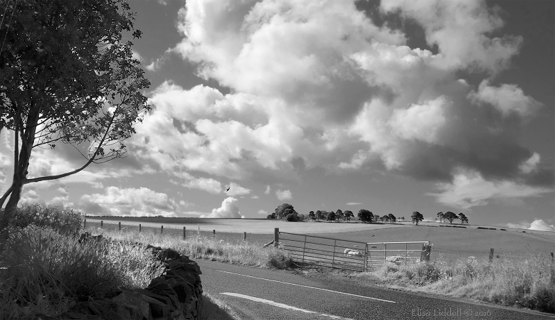
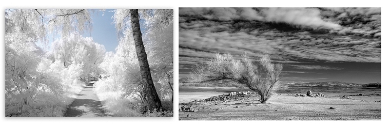
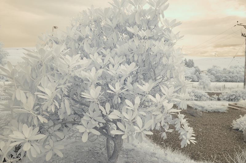
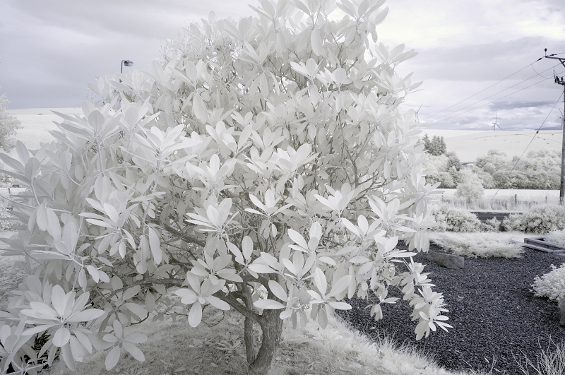
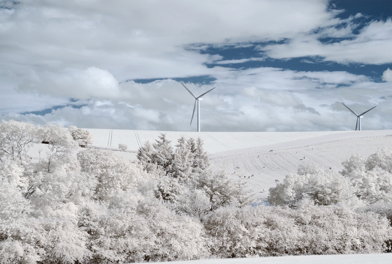
Most of what I’ve seen online are landscape shots, and that is a good part of what attracted me. There’s a whole lot of landscape and seascape here, and so many trees too. So I have taken my Nikon to each and every place I go shooting. It has refreshed familiar scenes to see them in a new way. But I rather wish that I had approached my IR journey of discovery by another route. Let me explain. I’ve made a still life comparison sequence here to show how the normal full colour photo can be rendered in PS into B+W, and then compared with the same shot taken on the Nikon IR 720nm. Well, the Nikon shot is almost the same, as I had partially dismantled the still life before the idea of a 3-way comparison struck me ;o)
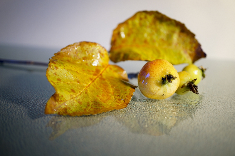
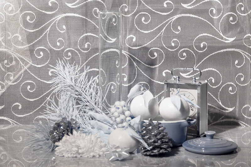
Here is the original still-life shot that I took for a Flickr challenge to include many colours. I’ve got blue, lavender and turquoise in the blue spectrum – reds and greens – then orange and golden tints as well as a patterned white background. The eyes are naturally drawn to the bright oranges, the reds and the blue glass vase first.

A colourful festive still life composition

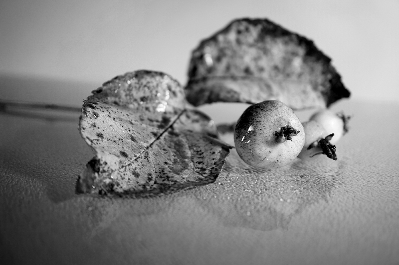
Transpose the shot into B+W and the blue glass along with the reds and greens become the dark tones, while the oranges have become the lightest tints. Look closely and the oranges still have their skin textures, as does everything else. The red berries may be darker, but you can see the sugary coating on each berry. The sparkles on the red and gold pine cones are also very clear. And the pine needles on the bottom left of the arrangement are even clearer than in the original shot. By removing the colour the textures of the elements has been made clearer.

The colourful festive still life composition in B+W

So what happens when you look through Infrared eyes? My arrangement is a little different, as I explained, but all the elements are still there. The first and most striking thing is that the blue glass is now completely transparent and only the optical distortion of the background pattern shows you that it is still there. The IR has also brought out the shadow cast by the glass, which is barely visible in the other 2 versions. It has done the same with the shadow cast by the clock. Look next at what it has done to the reds. Both the berries and the small ribbon bow at the very front are now white. The greens are also white, which is no surprise (one of the striking things we know about IR, tree leaves and grass become white) but look at the three oranges! They could be made of porcelain, together with their leaves they are so strikingly white!

The colourful festive still life composition in Infrared

Another surprising thing is that there IS colour in there. It is the gentle turquoise that has won the colour accolade. The blue has gone completely, but the turquoise is now a grey-blue. And another surprise is that the two pine cones, one red and one golden now have the same tonal values, both equally dark – and in IR they emerge as the darkest values of all, followed by the shadows that were not prominent in the other versions. The shadows (and the strength of the background too) might be related to a different camera and different lens with different F stop – but the striking differences remain. Using the infrared light band of the colour spectrum offers a completely different view to that experienced by the human eye.
I’m not big on technicalities, but there’s a lot of information on the range of IR filters that are available. I know that they range from the 500s to the 800s and are referenced in ‘nm’. I have 3 strengths:

  1. the 590nm (called the Super Goldie) which lets in more ‘normal’ colours that are within the IR spectrum
  2. the 720nm which is the one I have used above. That lets in a little from the ‘normal’ colour range. As you have seen there is some blue, and some yellow in the shots I’ve used so far.
  3. The 850 nm which is the closest to pure B+W in not admitting any other colours.
    I’ll be exploring what I have learned about all three in these articles. And adding to my own understanding as I go along – there’s nothing as helpful to learning as having to write about it. So this is helping me while (I hope) entertaining you!
    The first converted IR camera I bought was the Nikon D90 with the 720nm filter replacing the full colour original inside the camera itself.

So, on to part 3 where I’ll be considering the 720nm filter and what it can do

Back to the start of the IR section
My photography articles Talking Digital Photography
Flickr holds Elisa’s online Photo Gallery
© 2019 Elisa Liddell


Infrared first steps

Rhododendron. First steps in Infrared photography

or “Adventures in the Infrared wonderland – part 1”

I’ve written about my reasons for wanting to shoot or process images in B+W here and I ended the piece with these words; “Infrared is rather like ‘Alice’s Adventures in Wonderland’ – it is a whole different world, just waiting for us to explore down the rabbit hole ……”
I wasn’t joking, and I don’t think I was exaggerating either. Infrared can take us beyond the way that our eyes see naturally. Our eyes have been developed to see only part of the light spectrum. It’s not news to us – we all know there are X-rays we use to see inside the human body, getting beneath the skin, and seeing what the naked eye cannot. And we know there is ultraviolet light that can damage the skin, and we protect against it. Then there is our focus of interest, infrared light. Another part of the light spectrum that we cannot see with the naked eye, but another one that the camera can be adapted to ‘see’ for us.
We tend to think of these invisible light bands in scientific and medical situations, to help with a diagnosis, to perform a ‘virtual’ autopsy on an ancient Egyptian mummy, to see beneath the paint to verify an art-work. The uses of infrared light are many – the most ‘everyday’ is probably to be found in the remote control for your TV. But we can also use part of the infrared light spectrum in our personal photography – and reveal the world in a very different way.

I first came across infrared (IR) photos in the B+W groups, and, ever curious, I started to explore! When processing a colour shot into B+W in Photoshop there is a drop-down menu of options for you to try applying to your image, and among them is infrared. The perfect place to start! The journey had begun ;o)
But I was disappointed in the results I got. They didn’t look very different to the B+W options.

Infrared converted image using Photoshop

Indeed, when I posted this shot on Flickr no-one realised it was infrared processing!
And as I continued experimenting, I found that using IR conversion in Photoshop often produced a grainy effect – degrading the quality of the image. An old shot of crab apples with autumn leaves can demonstrate what I mean by the disappointing degradation of the image.

Crab apples in colour
Crab apples – the original shot in colour

I often take old images from my archives, and see how they look in B+W. Here a simple conversion gives smooth greys with the raindrops on the leaves even clearer than on the colour version. And there are white highlights and black spots too. So it is a pleasing, balanced conversion.

Crab apples in B+W
Crab apples in B+W

But try the infrared option in Photoshop, and even after adjusting every slider possible, the very best I can get is this.

Photoshop infrared conversion - crab apples
Photoshop infrared conversion of the colour crab apple shot

This is most definitely not what I had seen online. The results I saw there were inspiring!

Samples of Infrared images from online

So maybe Photoshop was not the way to go. What about trying a filter on one of my Sony cameras? I’m a huge fan of Sony, especially as I understand the on-board computer – something that turned me away from Nikon. An experimental play with a filter sounded good. But no – there were several articles mentioning that Sony was a really tricky choice for IR filters, and maybe for IR conversions too. Disappointment loomed! Then I came across eBay and found a seller in the UK who had modified old cameras so they would shoot ONLY in IR. And the old cameras were the Nikons I had used years ago! The sample shots looked exciting, so I decided to take a chance and see what happened. After all I could re-sell the camera on eBay if I found I’d made a miserable mistake.
Looking back, I think I really lucked out! I knew nothing about IR at all, but my first buy was ideal for me. I didn’t know it then, but there is a broad range of filters that give differing effects – and I bought a gentle filter that emphasises the delicate greys, rather than a harsher B+W filter. So early in July 2016 I bought an old Nikon D90 with a 720nm filter. The pixel size is small (4288×2848 pixels) compared to the cameras of today and the technology couldn’t touch my pocket RX100 (5472 x 3648). So I was wary about the gamble. The Nikon was all set to go, with an instruction sheet to help me. I attached the lens I’d been advised to use and tried it out.
Nothing fancy, just a few shots of the garden and the view across the howe (valley).

Nikon D90 first IR shots with 720nm filter
The garden. Nikon D90 first IR shots with 720nm filter
Rhododendron. Nikon D90 first IR shots
Rhododendron. Nikon D90 first IR shots with 720nm filter

Yes! That was the delicacy I wanted in the leaves – and I felt I was on my way!
Of course, now I would do a little editing to the faint colour cast and maybe choose something like this …

Rhododendron. colour cast adjustment in Photoshop

This was what I wanted – what had attracted me to infrared photography that I had seen online and on Flickr. I knew I had the place to start from – to explore this whole new way of looking at the world around me. The adventure was beginning ….
On to part 2

Back to the start of the IR section
My photography articles Talking Digital Photography
Flickr holds Elisa’s online Photo Gallery
© 2019 Elisa Liddell